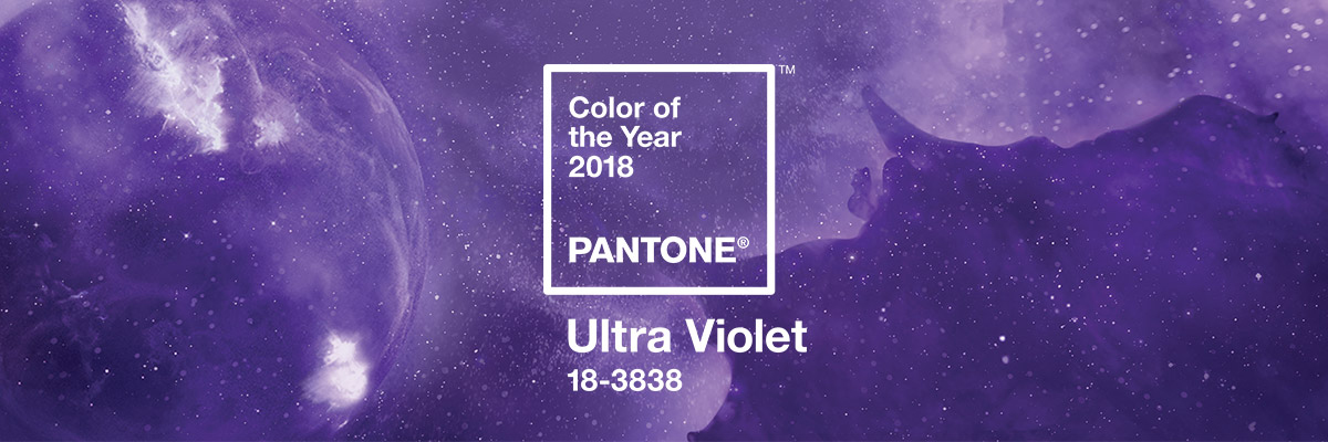
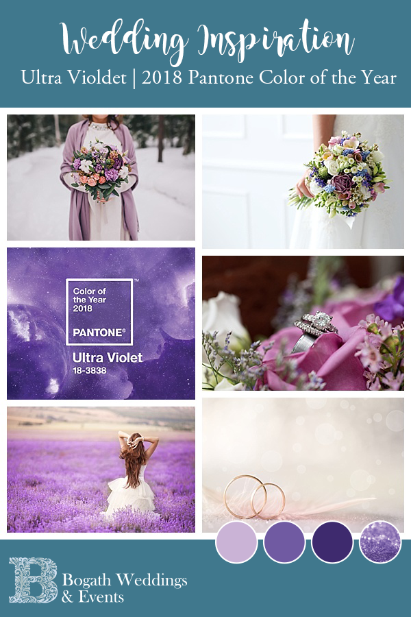
2018 Pantone Color of the Year Ultra Violet | Wedding Trends
The New Year is marked in a number of different way in our lives. Popping bubbly at exactly 12 pm. Smooching with your loved one at the stroke of midnight. Celebrating with a huge cheese platter (I’m not the only one, right?!?). Star Wars and Harry Potter marathons… But if you’re in the wedding or design industry, the New Year wouldn’t be the New Year without Pantone announcing their Color of the Year. In 2018 the Pantone Color of the Year Ultra Violet might just make you swoon and rethinking your wedding palette. Even if that’s not the the case, ’cause not everybody is a purple fan, today’s blog is going to give you a few different ideas on how Ultra Violet can be used in a number of different color palettes that will each create a different look and feel. You might find yourself moving, if ever so slightly to… The Purple Side.
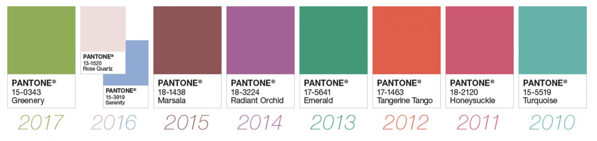
 Pantone Color of the Year | Previous Winners
If you have no idea what I’m talking about, that’s ok. Here’s a quick recap of previous year’s colors. Last year was Greenery. And it’s no coincidence that one of the biggest 2017 wedding trends was tons of greenery in florals. Pantone’s choice for color of the year tends to have a huge impact on design trends, not just in the wedding industry.
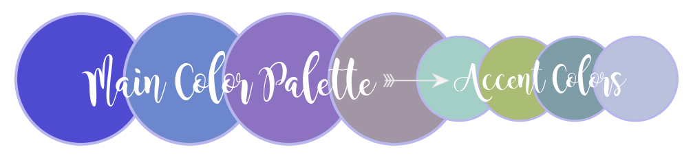
Pantone Color of the Year Ultra Violet | Color Combinations
So if you’re intrigued by this year’s choice, Pantone Color of the Year Ultra Violet, but not certain how to use it, let me see if I can help. I had to fall back on my graphic design background and dust out that corner of my brain where I had stored all my color theory knowledge. But here you go… The best Beach, Jersey Shore, LBI inspired color combinations using Pantone Color of the Year Ultra Violet.
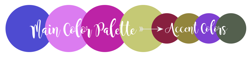
Anything-BUT-Basic Purple
 Violet and purple are colors that traditionally have been associated with luxury and royalty. In fact the actual reason for this is that the materials needed to dye fabric these colors were really expensive. During the Middle Ages, anyone wearing purple was rich enough to afford those dyes. So, hence the association between violet and luxury was born. You can use this to your advantage, without going overboard by adding just a little bit of shade to your color palette. This is done by toning the color down with just a little bit of black to create a calm palette of smoky color that is timeless and time-honored.
Ultra Violet is the New Blush
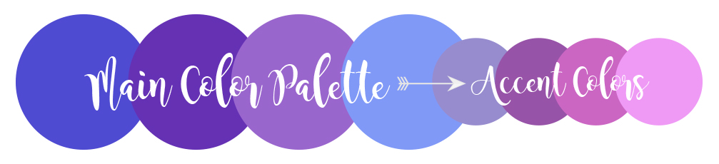 In color theory you can create a really appealing color scheme, technically called an analogous color scheme, by choosing colors that are near each other on the color wheel. A palette of like-minded hues often give an effect of spirited good humor and playful exuberance and makes for really easy and engaging color combinations. Lots of people choose this type of color palette when decorating their homes. But, interestingly, it probably would not work when getting dressed in the morning. Nothing like 5 different shades of violet to make people think you got dressed in the dark.
A Little Bit of Drama, But Not Too Much
 Bright saturated hues combined with earth tones are for the adventurous bride and groom. If you’re in the mood for a little bit of drama, this might be the perfect way to use Ultra Violet. But don’t get too crazy. Even though this is the Jersey Shore, it’s not that Jersey Shore.
Ultra Violet with a Twist of Beach
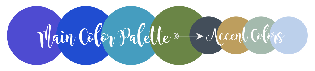 If you read my blog, you know I’m a beach girl. This might be my favorite way to use the Pantone Color of the Year Ultra Violet. It’s all about the open water… blues for the ocean and greens for the Barnegat Bay. Consider adding metallics like gold and silver for an understated beachy twist.
Subtle Earth Tones
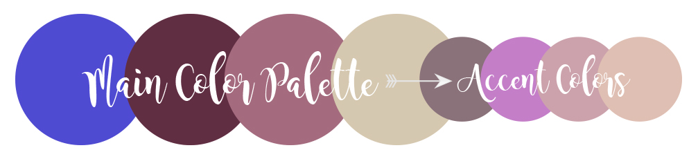 If you heard the name “Ultra Violet” and thought, no way too bright. Never fear. There is a way to use this color that will give a natural and organic effect. Pair it with creams and almonds and your guests will feel like they’ve stepped into a spa-like retreat!
Summer With Just the Right Amount of Jersey
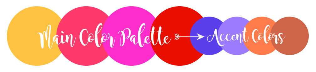
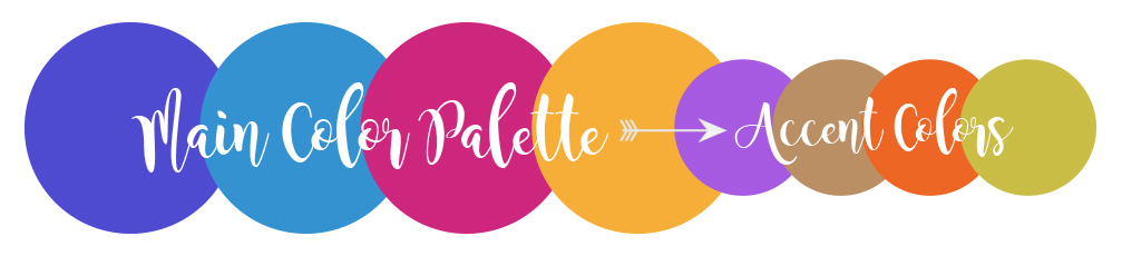 Zesty and Energetic, this color palette screams “look at me” comes together to create a bold statement with feelings of excitement and high voltage effects. If you’re looking for that party vibe, and the feel of a hot summer night for your wedding, this might jut be the palette for you and your groom.
Sunsets Down the Shore
 Colors that remind you of a summer sunset on the Barnegat Bay. This is a dramatic palette of brilliantly heightened warm shades that radiate across an early evening sky. I’m not a huge fan of a warm color palette, but that’s just me. If you love the idea of a warm color palette that reminds your guests of the sunset they will see at your Barnegat Bay-front venue, then this is it!
Spring Garden
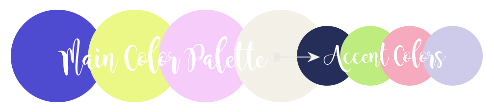 Pair Ultra Violet with some soft sweet pastels for a beautiful combination. Add a few accents of Ultra Violet with a deep dark navy and guests will be thinking all about the garden in full bloom. Perfect for a classic wedding at Bonnet Island Estate!
If you enjoyed today’s post on Pantone Color of the Year Ultra Violet, you will probably enjoy our post on Winter Weddings, check it out here.


PLEASE COMMENT BELOW